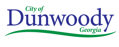
New City Logo for Dunwoody Unveiled
New City Logo for Dunwoody Unveiled
By Dyana Bagby, Dunwoody Reporter Newspaper
The city of Dunwoody soon will present a new look.
At the City Council retreat on Feb. 10, the council unanimously selected a new logo design shown to them by Communications Director Bob Mullen.
“We have the opportunity to create unity, pride and consistency and begin our logo anew,” Mullen said. “This is a new start for us.”
Because the city will have to purchase new business cards, letterhead and other city materials to incorporate City Hall’s new address on Ashford-Dunwoody Road, the time to start a rebranding of the city with a new logo has come, Mullen said. Next year also marks the city’s 10-year anniversary, a milestone that can also be celebrated with a new logo.
“Since we’ve become a city, I don’t think our brand has changed,” he said. “It’s the logo we want to look at.”
When Mullen brought up the idea of a new logo last year to tie into the move to the new City Hall building, he thought the city might need to spend more than $80,000 to hire professional consultants. The council was not happy with that amount and asked for something closer to $15,000.
The final result is actually a logo that cost zero dollars.
Three Dunwoody residents, all with professional backgrounds in graphic design and community development, stepped up to the plate to donate their time and services, Mullen explained.
The design team was made up of Jay Kapp, president and CEO of Kapp Koncepts; Mike Martin, chief creative officer for Jackson Spalding; and Heyward Wescott, president and CEO of Custom Signs Today.
The men donated nearly 40 hours of time, or about $6,000, to create three logo options for the council to choose from, Mullen said.
In the end, it was unanimous – the clean, simple design of the first logo presented was unanimously picked as the favorite for the city’s fresh start and rebranding campaign.
All council members said they preferred the simplicity of the logo design that states simply, “City of Dunwoody Georgia.” Dunwoody is a deep blue with “city of” and “Georgia” in a vibrant green.
A green, swooping line at the bottom of the logo is meant to convey a sense of vibrancy as well as indicate a sense of place by indicating Dunwoody is at the top of the Perimeter, Mullen said. The green swoosh also shows a thread of connectivity that symbolizes the city’s strong sense of community, he said.
“The idea [behind concept No. 1] was to create something classy,” Mullen said. The green swoosh shows an active, vibrant atmosphere and the overall design is simple and clean enough to appeal to many people, Mullen said.
Plans are to present the selected logo at a future City Council meeting to allow for public viewing.
As the city has grown and matured, the time for a new brand makes sense, Mullen said.
Dunwoody’s current logo also carries bad memories for some residents.
In 2010, the council, the Chamber of Commerce and the Conventions and Visitors Bureau of Dunwoody chipped in a combined $105,000 to hire a marketing firm to come up with a logo and slogan for the three entities.
The resulting logo says “Dunwoody” in blue accented by a lime-green asterisk. Beneath “Dunwoody” appear the words “Smart people – Smart City.” The original slogan was “Smart People – Smart Place,” but that had to be revised shortly after the logo was unveiled at a city music festival because city officials learned a city in Plano, Texas, used the same catchphrase.
At the time, a small but intense group of Dunwoody bloggers published criticisms of the original design. One popular complaint was that the logo looked like the Walmart logo with a yellow star and the slogan, “Save Money. Live Better.”
Two years ago, the CVBD ditched the asterisk and adopted its own logo.

